
文章内容
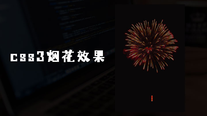
本文介绍如何使用 css3 animation制作烟花效果
完整代码
<!DOCTYPE html >
<html>
<head>
    <title>CSS3烟花效果 </title>
    <style>
        body {
            background-color: #090708;
        }
        .fireBox {
            position: fixed;
            z-index: -2;
            width: 100%;
            height: 100%;
            top: 0;
            left: 0;
        }
        .fire {
            width: 15%;
            position: absolute;
            bottom: 55%;
            transform: scale(0);
            animation: fire 3s 2.8s infinite;
        }
        @keyframes fire {
            0% {
                transform: scale(0);
            }

            80% {
                transform: scale(1);
            }

            100% {
                opacity: 0;
            }
        }
        .firecracker {
            width: 15%;
            position: absolute;
            text-align: center;
            height: 100%
        }
        .firecracker img {
            margin: 0 auto;
            position: absolute;
            bottom: 0%;
            animation: firecracker 3s forwards infinite;
            width: 8px;
            left: 50%;
            margin-left: -4px;
        }
        @keyframes firecracker {
            0% {
                transform: scale(1);
                bottom: -2%;
            }

            100% {
                bottom: 65%;
                transform: scale(0);
            }
        }
  </style>
</head>
<body>
    <div class="fireBox">
        <div class="fire">
            <img src="fire.png" width="100%"></div>
        <div class="firecracker">
            <img src="firecracker.png"></div>
    </div>
</body>
</html>
